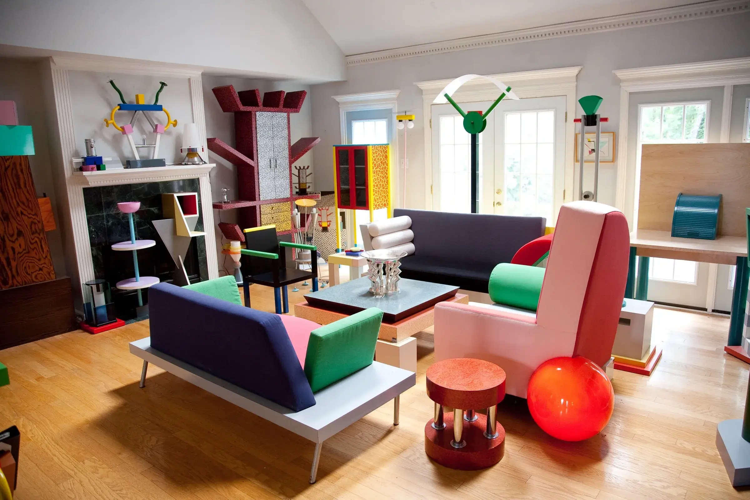
Primary colours. Jagged shapes. Patterns that look like a toddler went wild with a paint set…in the best way.
The Memphis Group threw out the rules of good taste. They ditched beige minimalism in favour of playful chaos. And in doing so, they made design fun again.
It was a rebellion against seriousness, sameness, and the idea that everything had to look a certain way to be taken seriously.
Sometimes, progress doesn’t look sleek. Sometimes it looks strange, joyful, and a bit too much. And that’s okay.
(Also: imagine a grant management platform that looked like this. Just saying…)